The colors that surround us are far more than decorative finishes or aesthetic preferences—they are psychological tools that quietly govern our emotional state, cognitive clarity, and even physical comfort. In interior environments, every hue carries an invisible weight that can shift our perception of temperature, influence our sense of space, and subtly alter mood. In a world increasingly defined by constant digital interaction and sensory stimulation, the interior color palette has taken on a new role: as both a sanctuary for mental decompression and a catalyst for creative engagement.
At its core, color affects us through three variables—hue, saturation, and contrast. Hue determines the emotional family of a color: blues and greens often evoke calmness, while reds, oranges, and yellows communicate warmth, energy, and enthusiasm. Saturation—how pure or muted a color appears—affects intensity and focus. Highly saturated tones stimulate the senses, demanding attention, while softer or desaturated versions provide a sense of quiet balance. Contrast, the relationship between light and dark shades, shapes depth perception and visual rhythm; in psychological terms, it can dictate whether a space feels dynamic or restful.
Scientific studies have long demonstrated that human responses to color are rooted in both biology and environment. For example, blue wavelengths can lower blood pressure and encourage concentration, explaining why shades of navy or sky blue are often used in offices or study rooms. Yellow, associated with sunlight and optimism, can increase feelings of happiness and creative spontaneity—but if overused or too bright, it can also cause anxiety. Green, representing nature and renewal, is one of the most balanced hues for maintaining mental stability and creative flow, making it ideal for home studios or collaborative workspaces.
The psychological landscape of interior design is further complicated by the fact that no color exists in isolation. Context changes everything. A cool gray wall may feel soothing when paired with warm wood textures but sterile when surrounded by metallic finishes. This interplay highlights the importance of contrast and harmony—two principles that define not only visual beauty but also emotional equilibrium.
In an age when we live and work in the same spaces, the emotional calibration of our environments has become essential to well-being. The right combination of colors can encourage both relaxation and productivity, offering the balance that digital fatigue often disrupts. In this sense, designing with color is not merely a matter of taste; it is an act of psychological architecture—crafting atmospheres that guide the mind back toward balance, focus, and imaginative courage.
Designing interiors for creativity and emotional intelligence begins with an understanding that colors interact dynamically with light, texture, and human perception. A “chromatic blueprint” emerges when these factors work together to support the occupants’ mental states. Soft light bouncing off a pale terracotta wall at sunrise creates a very different psychological effect from the same hue under cool LED light. This interplay between natural and artificial illumination can dramatically alter mood—warmer light tends to promote comfort and intimacy, while cooler light boosts alertness and cognitive accuracy.
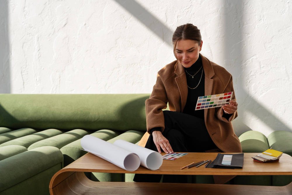
Strategic color pairing is another vital mechanism for emotional and creative tuning. Complementary contrasts—such as teal with copper accents or lavender with mustard—offer visual excitement that stimulates ideation without overwhelming the senses. Analogous combinations, where colors sit side by side on the spectrum (like blue, turquoise, and green), create visual continuity that soothes the mind and promotes sustained focus. The art of combining hues lies in achieving tension and release: too much uniformity dulls the senses, while excessive contrast generates fatigue.
Cultural and personal associations also shape how we interpret colors. In some traditions, white symbolizes purity and new beginnings; in others, it represents mourning or spiritual distance. Red can be both invigorating and intimidating depending on context and cultural upbringing. This subjective quality means that truly effective design is empathetic—it considers not only how colors look under light but how they are felt within the framework of personal experience.
Neuroscience supports these observations. Color influences how the brain processes information and how emotions are regulated. Warm accent walls may activate regions of the brain related to social interaction and enthusiasm, while cooler backdrops facilitate analytical thought. This suggests that a balanced interior—often achieved through layering warm and cool tones—can strengthen both creative ideation and critical reasoning. It’s a reminder that creativity thrives in conditions that oscillate between stimulation and rest, between expressive intensity and visual stillness.
Practical interior planning applies this science by aligning color psychology with function. Bedrooms benefit from muted blues, earthy beiges, and soft lavenders that lower heart rate and signal restfulness. Workspaces can incorporate small bursts of energizing colors—like coral, yellow, or mint—especially in personalized areas that require innovation. In creative studios or brainstorming zones, gradient techniques or shifting accent walls can subtly cue the brain to transition between divergent and convergent thinking modes.
Ultimately, the thoughtful orchestration of color in interior spaces is both an art and a science—a form of emotional engineering that supports how we think, feel, and imagine. When color design integrates neuroscience and aesthetic psychology, interiors become more than simply environments; they evolve into living systems that nurture our emotional resilience and creative growth. In a world where mental wellness and innovation have become daily pursuits, understanding how interior colors affect mood and creativity gives us the palette not just to decorate rooms, but to design better versions of ourselves.